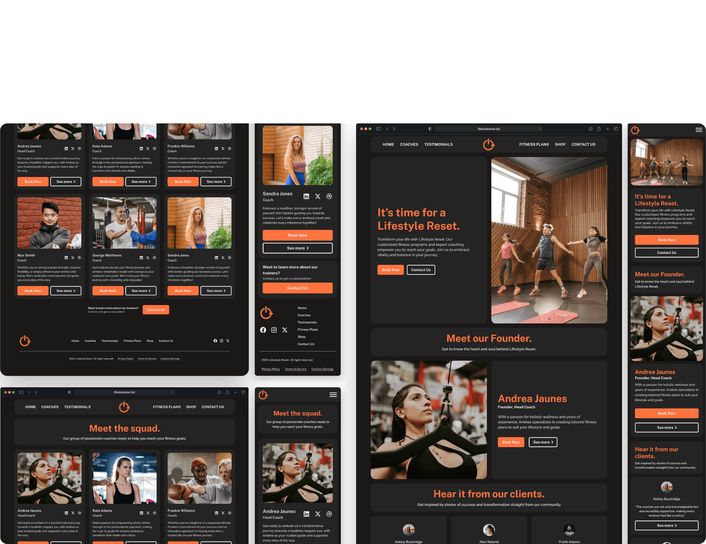
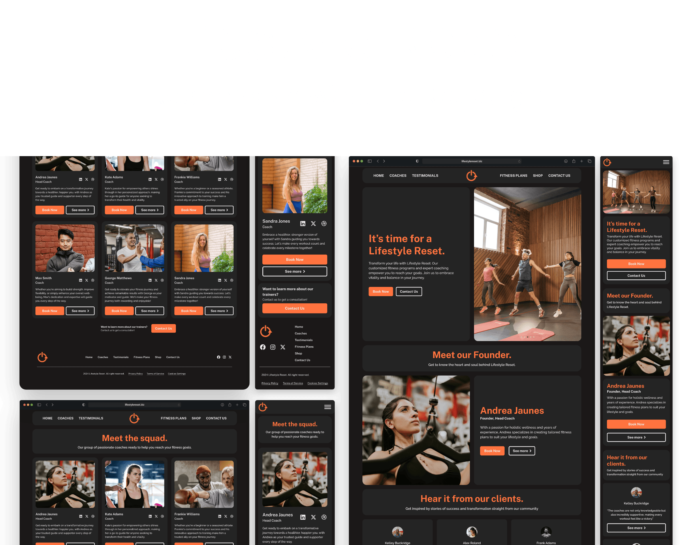

It's time for a Lifestyle Reset.
Introduction
Introduction
Lifestyle Reset is a Bay Area based health and fitness coaching service. Their purpose is to operate with integrity, virtuousness and to always put their clients needs first. They want to help their clients achieve vitality and happiness by creating health and fitness goals that are safe, natural, fun, and sustainable.
When I came across the website, it was very difficult to understand what was going on. I knew from the start, that I could help this company create a different layout for their website and help them out. I tried reaching out to the owner of the company a few times, but they never replied back to my email. I still continued with the redesign.
Problem
Problem
Problem
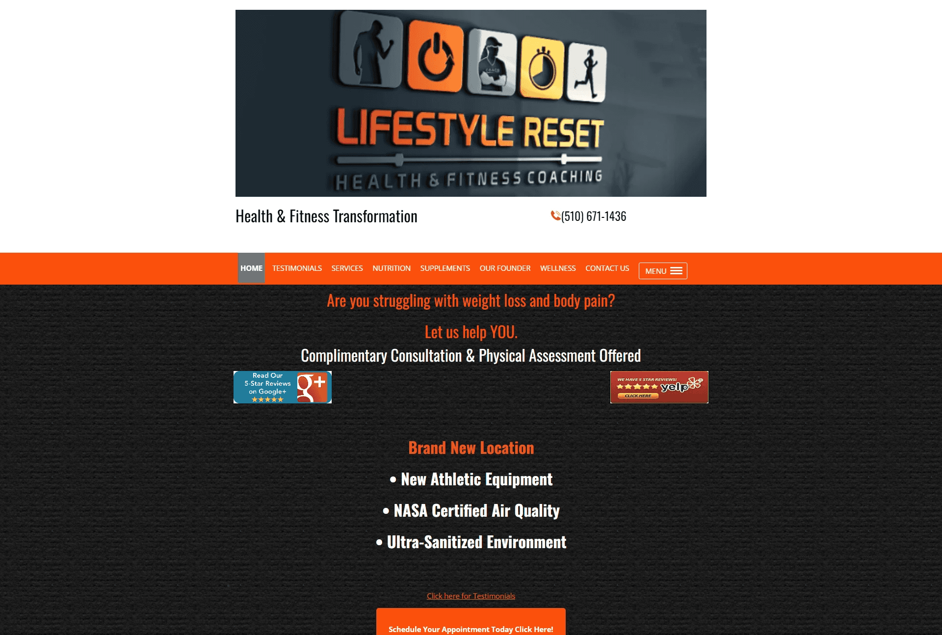
When I first visited the website, the issues were very prominent. As soon as you are on the home page, you are greeted with a large blurry banner. As you scroll down, you can see that there is a lack of hierarchy when it comes to the content in the beginning of the homepage. Just by the image below, the contrast of the text color and the background colors and the weight of the font make it difficult to read.
When I first visited the website, the issues were very prominent. As soon as you are on the home page, you are greeted with a large blurry banner. As you scroll down, you can see that there is a lack of hierarchy when it comes to the content in the beginning of the homepage. Just by the image below, the contrast of the text color and the background colors and the weight of the font make it difficult to read.
When I first visited the website, the issues were very prominent. As soon as you are on the home page, you are greeted with a large blurry banner. As you scroll down, you can see that there is a lack of hierarchy when it comes to the content in the beginning of the homepage. Just by the image below, the contrast of the text color and the background colors and the weight of the font make it difficult to read.


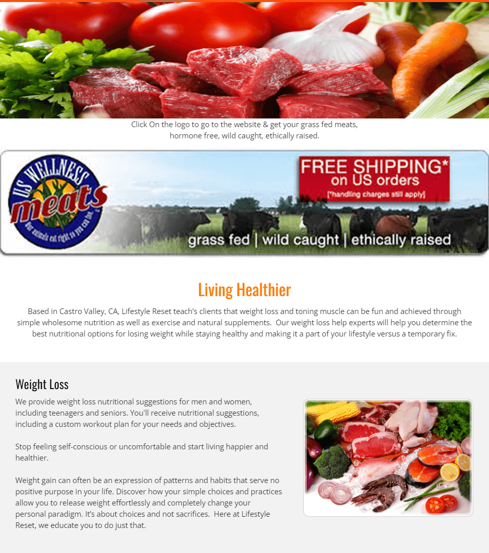
Going to the nutrition page, the text and background color contrast is better, but it uses a lot of blurry images. To my surprise, some of the banners that you see on this webpage are linked to another website.
Going to the nutrition page, the text and background color contrast is better, but it uses a lot of blurry images. To my surprise, some of the banners that you see on this webpage are linked to another website.
Going to the nutrition page, the text and background color contrast is better, but it uses a lot of blurry images. To my surprise, some of the banners that you see on this webpage are linked to another website.


I tested the responsiveness of the website, and I think it's been done pretty well. For this project, I aim to redesign the website to make it easier to navigate, fix it's hierarchy, and overall modernize it's feel.
I tested the responsiveness of the website, and I think it's been done pretty well. For this project, I aim to redesign the website to make it easier to navigate, fix it's hierarchy, and overall modernize it's feel.
I tested the responsiveness of the website, and I think it's been done pretty well. For this project, I aim to redesign the website to make it easier to navigate, fix it's hierarchy, and overall modernize it's feel.
Competitive Analysis
Competitive Analysis
I found three local fitness coaches who provide online and in-person coaching. These websites appear to be well designed from the first glance. Most likely, the coaches used a template and added their information to it, then just changed it to their liking. The coaches also used high-quality photos and arranged the photos in a way that was pleasing to the eye. On mobile devices, these websites aren't properly responsive, which is a common problem. Font weight, contrast, or color make a lot of text hard to read. Based on my comparison of these websites with the fitness coach I had chosen, it appears that they have a better chance at getting clients.
I found three local fitness coaches who provide online and in-person coaching. These websites appear to be well designed from the first glance. Most likely, the coaches used a template and added their information to it, then just changed it to their liking. The coaches also used high-quality photos and arranged the photos in a way that was pleasing to the eye. On mobile devices, these websites aren't properly responsive, which is a common problem. Font weight, contrast, or color make a lot of text hard to read. Based on my comparison of these websites with the fitness coach I had chosen, it appears that they have a better chance at getting clients.
I found three local fitness coaches who provide online and in-person coaching. These websites appear to be well designed from the first glance. Most likely, the coaches used a template and added their information to it, then just changed it to their liking. The coaches also used high-quality photos and arranged the photos in a way that was pleasing to the eye. On mobile devices, these websites aren't properly responsive, which is a common problem. Font weight, contrast, or color make a lot of text hard to read. Based on my comparison of these websites with the fitness coach I had chosen, it appears that they have a better chance at getting clients.
User Interviews
User Interviews
Who did I interview?
Who did I interview?
When thinking about who I wanted to interview, I thought of clients who would want to have in-person and online health and fitness services. I asked a few friends and family if they have ever tried any in-person or online health or fitness services and gathered 5 interviewees.
When thinking about who I wanted to interview, I thought of clients who would want to have in-person and online health and fitness services. I asked a few friends and family if they have ever tried any in-person or online health or fitness services and gathered 5 interviewees.
What were my goals?
What were my goals?
I had an idea on what clients would want to be presented with when looking for a health and fitness coach, but during my interview I wanted to find out what clients saw as most important when looking at a health and fitness website. I also wanted to learn, what encourages a user to book or contact a fitness coach?
I had an idea on what clients would want to be presented with when looking for a health and fitness coach, but during my interview I wanted to find out what clients saw as most important when looking at a health and fitness website. I also wanted to learn, what encourages a user to book or contact a fitness coach?
What did I discover?
What did I discover?
While I had a few ideas on what clients usually look for when deciding whether to book or contact a fitness coach, my interviews further validated my theories. All the participants that I had in these interviews heavily emphasized that they refer back to any reviews about the company Even though I knew these were important, I never realized how much emphasis users put on this feature.
While I had a few ideas on what clients usually look for when deciding whether to book or contact a fitness coach, my interviews further validated my theories. All the participants that I had in these interviews heavily emphasized that they refer back to any reviews about the company Even though I knew these were important, I never realized how much emphasis users put on this feature.
Participants had a big emphasis on other clients reviews
Participants had a big emphasis on other clients reviews
Participants had a big emphasis on other clients reviews
Participants had a big emphasis on other clients reviews
Another big consideration was how friendly and responsive the fitness coaches are.
Another big consideration was how friendly and responsive the fitness coaches are.
Another big consideration was how friendly and responsive the fitness coaches are.
Another big consideration was how friendly and responsive the fitness coaches are.
At the end of the interviews, I wanted to place a big emphasis on communication and client testimonials. I started to brainstorm ways I could design the website to encourage the users to communicate and place their trust with Lifestyle Reset.
At the end of the interviews, I wanted to place a big emphasis on communication and client testimonials. I started to brainstorm ways I could design the website to encourage the users to communicate and place their trust with Lifestyle Reset.
Personas
Personas
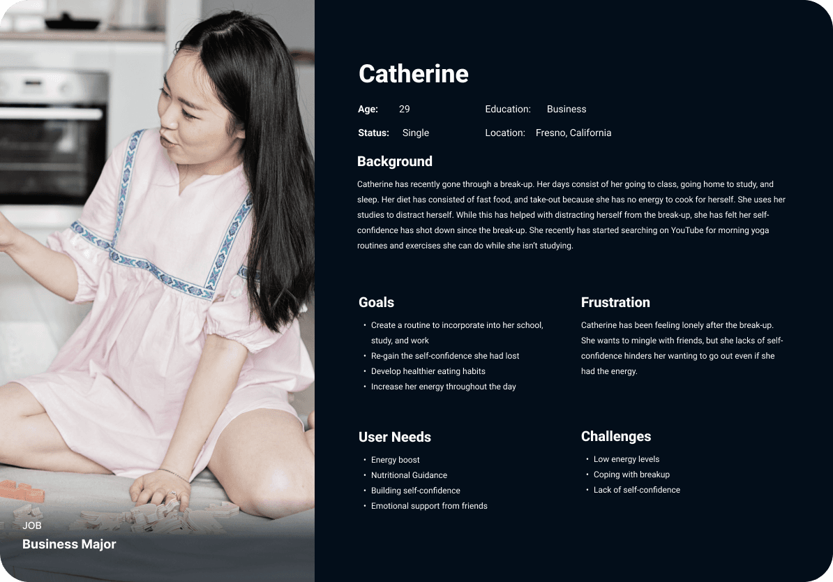


Catherine wants to mingle with friends but her lack of self-confidence hinders her going out even if she had the energy.
Catherine wants to mingle with friends but her lack of self-confidence hinders her going out even if she had the energy.
Introducing, the redesign of Lifestyle Reset.
Introducing, the redesign of Lifestyle Reset.
I wanted Senior Serenity to be easy to use, but even before using the service, I wanted the user to feel welcome and trust the application to give care homes they would potentially have their client or family member be residing in.
I wanted Senior Serenity to be easy to use, but even before using the service, I wanted the user to feel welcome and trust the application to give care homes they would potentially have their client or family member be residing in.
Color Palette
Color Palette

orange
Orange is a part of the brand colors for Lifestyle Reset and I did not want to change it's primary brand color.
The color green can invoke feelings of balance, serenity and joy.
I need a darker color for the text and I decided to use a lighter shade of black for it to be easier on the eyes.
I need a darker color for the text and I decided to use a lighter shade of black for it to be easier on the eyes.

black

off-white
A pure color white can be a bit harsh, so I chose to add a hint of orange.
A pure color white can be a bit harsh, so I chose to add a hint of orange.
Font
Font
Public Sans Extrabold
Public Sans Extrabold
Public Sans Extrabold
Raleway Medium
Raleway Medium
Raleway Medium
Icons
Icons

Logo
Logo
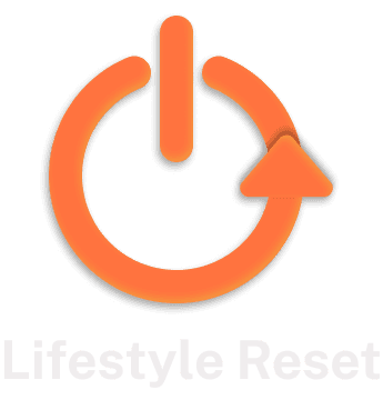
I wanted to simplify the logo of lifestyle reset so it would be easier to use on things such as business cards, letters, emails etc… Making logos is not the strongest skill I have, but I hope to continue to improve on it.
I wanted to simplify the logo of lifestyle reset so it would be easier to use on things such as business cards, letters, emails etc… Making logos is not the strongest skill I have, but I hope to continue to improve on it.
Mid-Fidelity Wireframe
Mid-Fidelity Wireframe
While creating a mid-fidelity wireframe, I thought of the website as some sort of portfolio for Lifestyle Reset. I wanted them to showcase their testimonials, coaches, and have ways to contact on every page. I conducted a usability test during the mid-fidelity wireframes with these tasks:
How would you find the coaches of Lifestyle Reset?
How would you book a consultation for cardio training?
How would you contact Lifestyle Reset for a general inquiry?
How would you find the feedback from other clients?
I had 5 participants for the mid-fidelity usability testing whose ages range from 25-35. All tasks were completed, but in different ways. For example, 2/5 users used only the homepage to complete all tasks while 3/5 users used the navigation and other pages of the website to complete the tasks. The main concern for me during this testing was when I got this feedback:
Specify the booking
Specify the booking
In the mid-fidelity wireframes, as you can see that whenever a user were to book a consultation, they weren't prompted to specify the fitness plan or coach they wanted a consultation with. In the hi-fidelity, I added drop down options which would prompt the user to choose what plan or coach they would want to book with.
In the mid-fidelity wireframes, as you can see that whenever a user were to book a consultation, they weren't prompted to specify the fitness plan or coach they wanted a consultation with. In the hi-fidelity, I added drop down options which would prompt the user to choose what plan or coach they would want to book with.
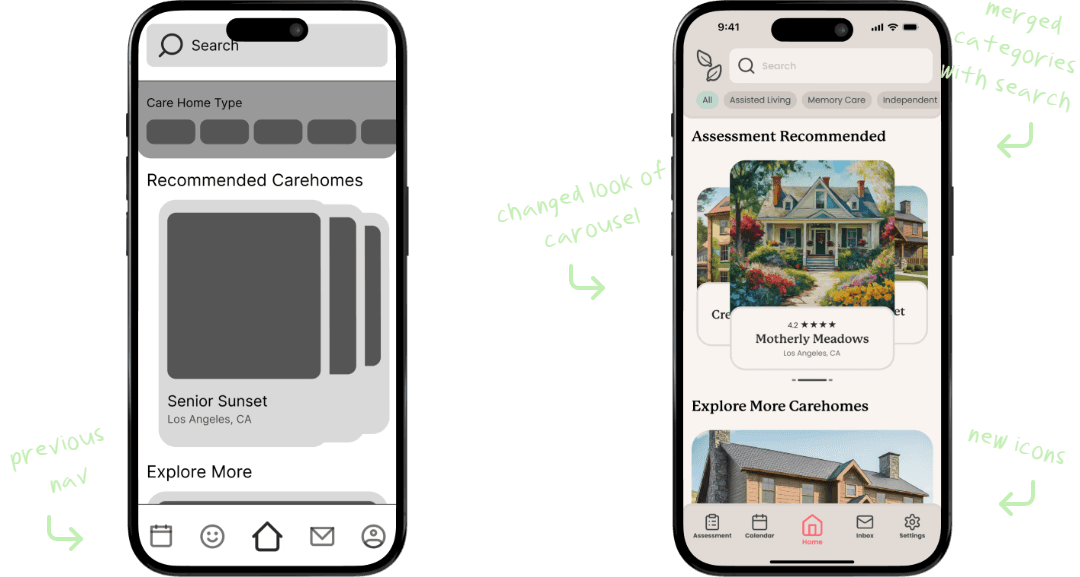

Clarification of the contact form
Clarification of the contact form
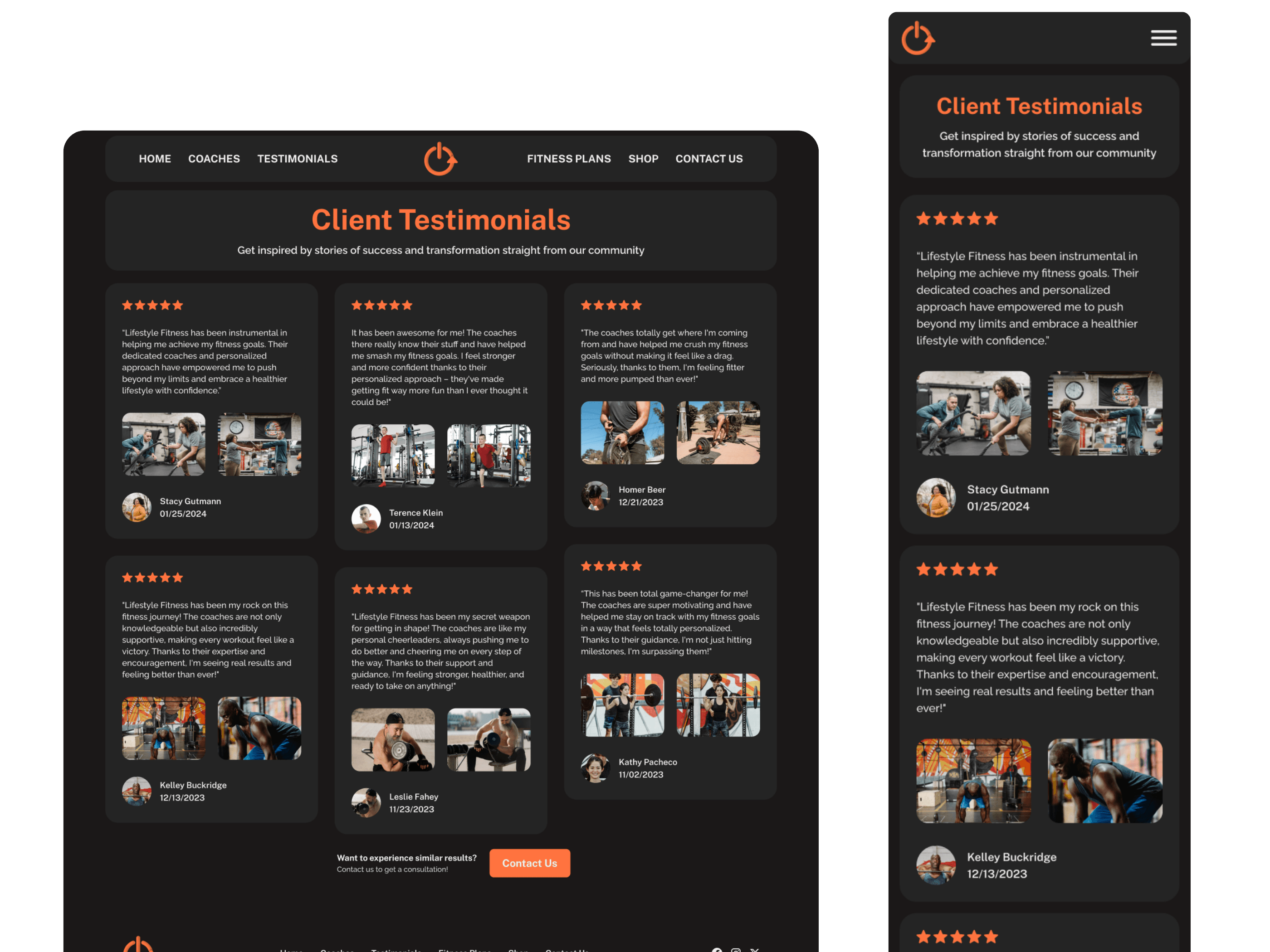
When at the testimonials page, users enjoyed knowing there were testimonials to look through, but had a couple questions about the contact form at the bottom. 4/5 participants of the usability testing had thought that the contact form was a testimonials submission form. So, for the hi-fidelity I decided to create a button that will lead to the contact page instead.
When at the testimonials page, users enjoyed knowing there were testimonials to look through, but had a couple questions about the contact form at the bottom. 4/5 participants of the usability testing had thought that the contact form was a testimonials submission form. So, for the hi-fidelity I decided to create a button that will lead to the contact page instead.


Lifestyle Reset Homepage
For the homepage, I did not change much from the mid-fidelity to the high-fidelity design.
For the homepage, I did not change much from the mid-fidelity to the high-fidelity design.


Coaches Page
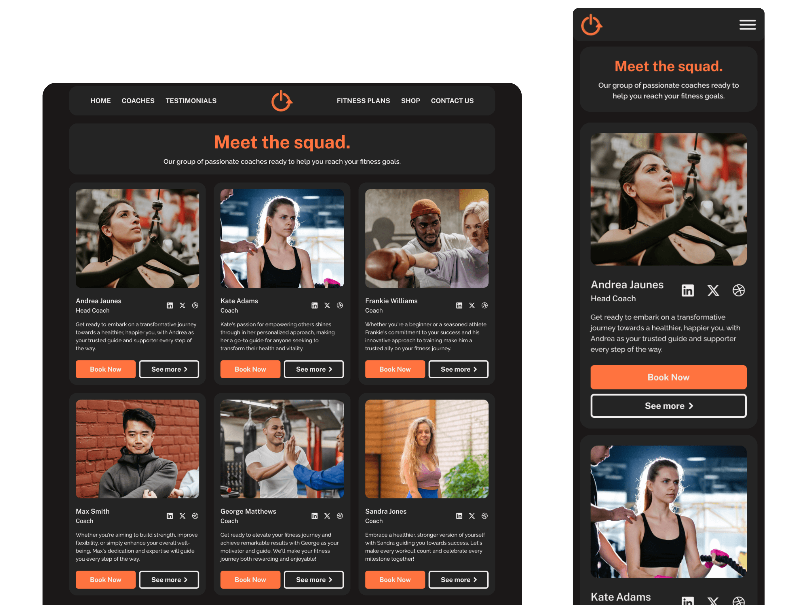
For the coaches page, participants were asking for a way to learn more about the coach they are interested in. To implement this, I decided to add a "See more" button and a modal pop-up to see more about the coaches.
For the coaches page, participants were asking for a way to learn more about the coach they are interested in. To implement this, I decided to add a "See more" button and a modal pop-up to see more about the coaches.


FItness Plans Page
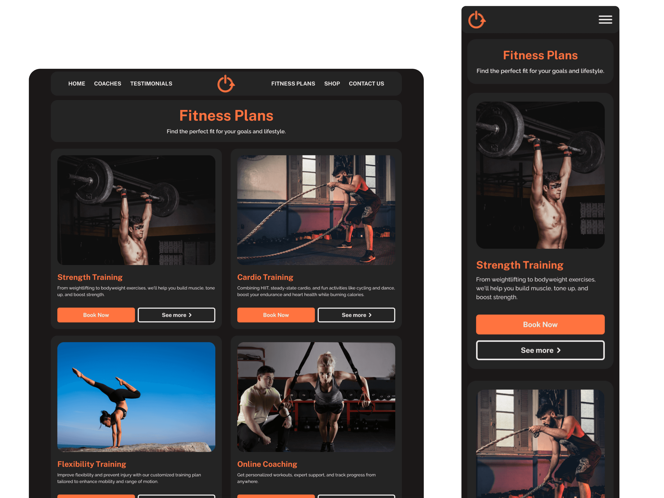
As for the fitness plans page, I decide to make the "see more" button into a "Book Now" button instead so users would be able to book from the fitness plans page.
As for the fitness plans page, I decide to make the "see more" button into a "Book Now" button instead so users would be able to book from the fitness plans page.


Hi-Fidelity Usability Test
Hi-Fidelity Usability Test
After creating the first hi-fidelity mockup, I once again conducted usability tests. The tasks I had these participants do were similar to the tasks I had my mid-fidelity participants do. During these tests, I had created a scenario for each of the task and I had my participant be an potential client of Lifestyle Reset
Scenarios:
You stumbled upon Lifestyle Reset during your search for a fitness coach. You're interested and wanted to learn more about the staff. How would you do so?
After looking at the coaches, you want to see previous client experiences with Lifestyle Reset. How would you do so?
You are happy with what you have read on the testimonials page and want to book a consultation for cardio training. How would you do so?
You have more questions so you want to contact Lifestyle Reset to ask about more personal questions. How would you contact them?
I had 5 participants with ages 27-35. All participants finished each task with different ways on how to complete the task. Although all tasks were completed, participants had some feedback that I liked to include in my project:
Clickable cards
Clickable cards
At the fitness plans page, 3/5 participants did not know that the fitness plan cards were clickable. To remedy this problem, I added an extra button at the bottom of the card to show that users can click on this button to navigate them to the fitness details page. You can also see at this page, I made it so that the header of each page is changed to the color orange so it can stand out more.
At the fitness plans page, 3/5 participants did not know that the fitness plan cards were clickable. To remedy this problem, I added an extra button at the bottom of the card to show that users can click on this button to navigate them to the fitness details page. You can also see at this page, I made it so that the header of each page is changed to the color orange so it can stand out more.
Booking with a coach at the coaches page
Participants had mentioned that they enjoyed seeing all the coaches and their specialties in one page. 2/5 participants suggested that if a user were to really want to contact or book with a specific coach, that they should be able to do that within the coaches page. I explained to the users that was the function of the button, but to clarify it to the users I changed the button label from "Book Now" to "Book (coach name here)"
Participants had mentioned that they enjoyed seeing all the coaches and their specialties in one page. 2/5 participants suggested that if a user were to really want to contact or book with a specific coach, that they should be able to do that within the coaches page. I explained to the users that was the function of the button, but to clarify it to the users I changed the button label from "Book Now" to "Book (coach name here)"
At around this time, Lifestyle Reset had not gotten back to me about the redesign of their website, so I decide to change the name of the head coach.
At around this time, Lifestyle Reset had not gotten back to me about the redesign of their website, so I decide to change the name of the head coach.
At around this time, Lifestyle Reset had not gotten back to me about the redesign of their website, so I decide to change the name of the head coach.
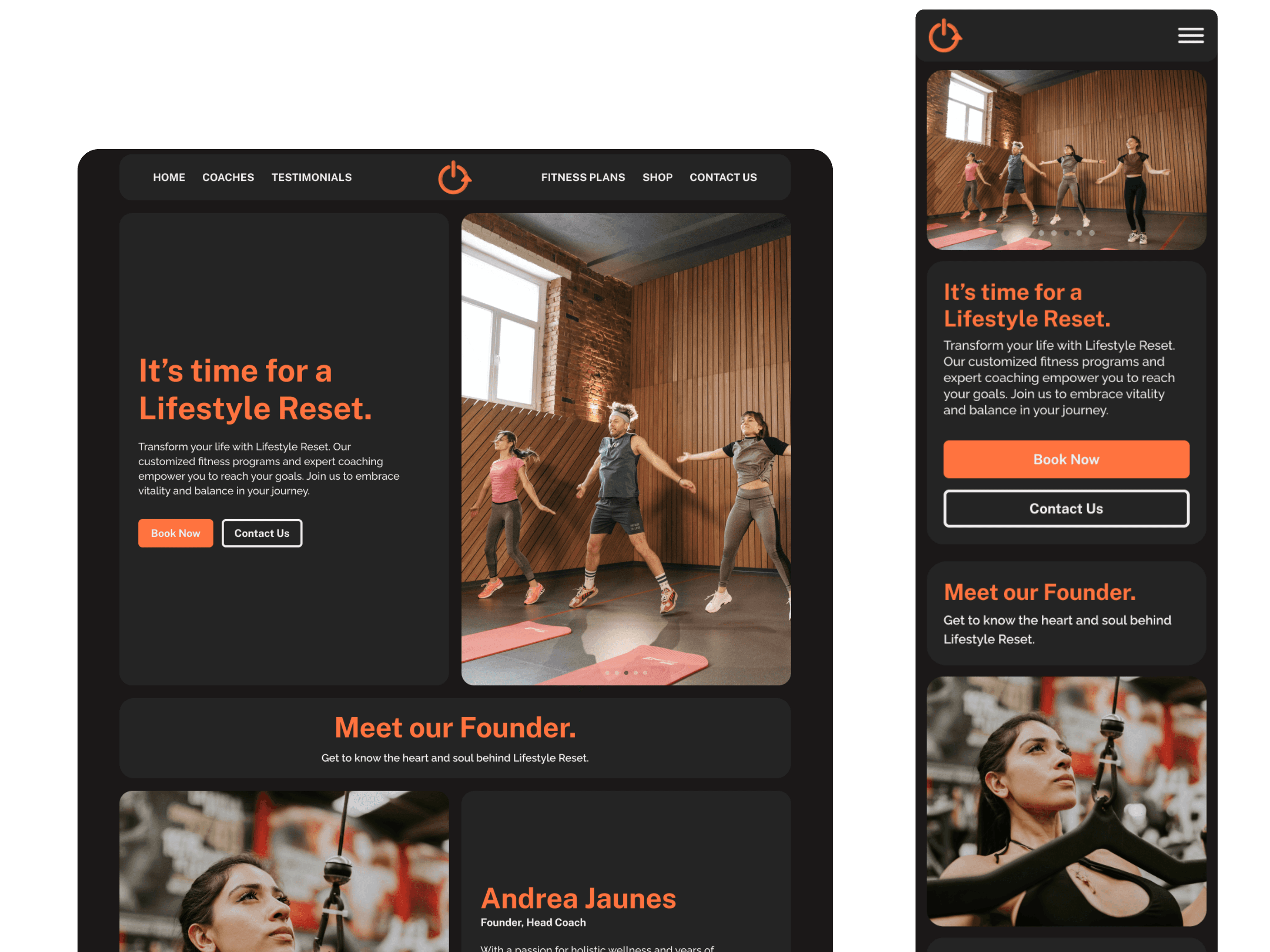
Al look thought the screens of the final mock up.
Al look thought the screens of the final mock up.
Homepage
Homepage


Coaches Page
Coaches Page


Testimonials Page
Testimonials Page


Fitness Plans page
Fitness Plans page


Final Thoughts
Final Thoughts
This was my first time redesigning a website to be responsive and I'm very happy with the outcome! I enhanced my Figma skills withe auto-layout and am still very eager to learn more in the future! I enjoyed learning what users found most important and learned a lot about usability testing during this process. With this final design, I hope to learn more and to achieve more as I grow as a designer.
This was my first time redesigning a website to be responsive and I'm very happy with the outcome! I enhanced my Figma skills withe auto-layout and am still very eager to learn more in the future! I enjoyed learning what users found most important and learned a lot about usability testing during this process. With this final design, I hope to learn more and to achieve more as I grow as a designer.
