Introduction
Introduction
There are only a few ways that a family member of a potential resident can find a care home for their loved one. One is a referral from a case manager to a referral agency or family members can search online for care homes in their area, and word of mouth. Care homes with websites aren’t very common and usually are only for the bigger care homes in the area.
In California, there is another way to find care homes and that is through CalRegistry. You would need to call their number and talk with a counselor to ask what your budget is and your loved ones needs and then they would list out which care homes are available in your area. What if there was a way to find a care home with the amenities, services, and care your loved one needs and be able to contact, inquire, and request a tour at the same time?
What if there was a way to find a care home with the amenities, services, and care your loved one needs and be able to contact, inquire, and request a tour at the same time?
What if there was a way to find a care home with the amenities, services, and care your loved one needs and be able to contact, inquire, and request a tour at the same time?
Problem
Problem
Problem
People have difficulty finding care homes that will be best suited for their loved ones needs.
People have difficulty finding care homes that will be best suited for their loved ones needs.
People have difficulty finding care homes that will be best suited for their loved ones needs.
Potential Users
Potential Users
Potential Users
Family of potential residents
Placement agencies
Social workers
Family of potential residents
Placement agencies
Social workers
Solution
Solution
Solution
An accessible, efficient way to explore, contact, and book care homes in your area.
An accessible, efficient way to explore, contact, and book care homes in your area.
An accessible, efficient way to explore, contact, and book care homes in your area.
Competitive Analysis
Competitive Analysis
For my competitive analysis, I looked at Caring.com, A Place for Mom, and Senior Advisor. The websites of these care homes share a similar approach of providing an advisor to families/persons looking for a care facility for their loved one. A Place for Mom and Caring.com implement AI chats that allow users to quickly enter their information and be contacted by an advisor later. Senior Advisor does not have an AI chat feature; instead, they display CTAs and a pop-up that prompts users to submit their information. There is more information on each of these websites that educates the user about the specific types of care homes and care for seniors. In addition, the layout for each website is very similar, with the nav bar displaying different types of care homes or nursing homes and a contact number. Unless users choose to call the number or opt out of giving their information, much of the information would come from user reviews, which might be biased. Additionally, not all care homes are listed in the lists. Using the care home finder, I found that the care home where I used to work did not appear. Based on these findings, I can see that my idea is very different from what is currently happening in the industry. Most of these care homes' websites provide information and connect users with advisors, but they differ in features, such as AI chats and submission forms. Review sites may not list all care homes and there are limitations to relying solely on user reviews. In light of these findings, I need to further explore and develop my unique idea.
Most of these care homes' websites provide information and connect users with advisors, but they differ in features, such as AI chats and submission forms…In light of these findings, I need to further explore and develop my unique idea.
Most of these care homes' websites provide information and connect users with advisors, but they differ in features, such as AI chats and submission forms…In light of these findings, I need to further explore and develop my unique idea.
User Interviews
User Interviews
Who did I interview?
Who did I interview?
Initially, I wanted to interview families of current residents, but they either declined or there was no time in their schedules. Instead, I connected with adults currently working in aged care facilities or similar establishments. The participants I interviewed were
22-66 years old
currently working in an aged care facility
passionate about their work
Four out of five participants have 18+ years in the industry
What were my goals?
What were my goals?
Having worked in the industry, I had some idea on how residents were being placed in care homes but I wanted more clarity.
Find how residents are being placed in care homes
Find the pain points of placing residents in care homes
What is the criteria when placing a resident in a care home
Having worked in the industry, I had some idea on how residents were being placed in care homes but I wanted more clarity.
Find how residents are being placed in care homes
Find the pain points of placing residents in care homes
What is the criteria when placing a resident in a care home
What did I discover?
What did I discover?
While interviewing the participants, I had thought I would get more insight from the pain points of families with the questions I had procured, instead I got pain points of the owners and administration staff. Here are a couple of insights:
While interviewing the participants, I had thought I would get more insight from the pain points of families with the questions I had procured, instead I got pain points of the owners and administration staff. Here are a couple of insights:
Care home owners have specific types of residents they are willing to admit
Care home owners have specific types of residents they are willing to admit
Care home owners have specific types of residents they are willing to admit
Care home owners have specific types of residents they are willing to admit
Inaccurate resident pre-assessments
Inaccurate resident pre-assessments
Inaccurate resident pre-assessments
Inaccurate resident pre-assessments
At the end of the interviews, my idea for this application was coming together. I was worried that not having interviewed families of residents was going to delay or change my idea completely, but it did not. From these interviews, I discovered that owners and administration have a pain point of not getting correct pre-assessments of their resident. I thought of ways of how can I as a designer, help solve this pain point? And, the solution I have is having the adult children do a pre-assessment of their senior parent.
At the end of the interviews, my idea for this application was coming together. I was worried that not having interviewed families of residents was going to delay or change my idea completely, but it did not. From these interviews, I discovered that owners and administration have a pain point of not getting correct pre-assessments of their resident. I thought of ways of how can I as a designer, help solve this pain point? And, the solution I have is having the adult children do a pre-assessment of their senior parent.
Personas
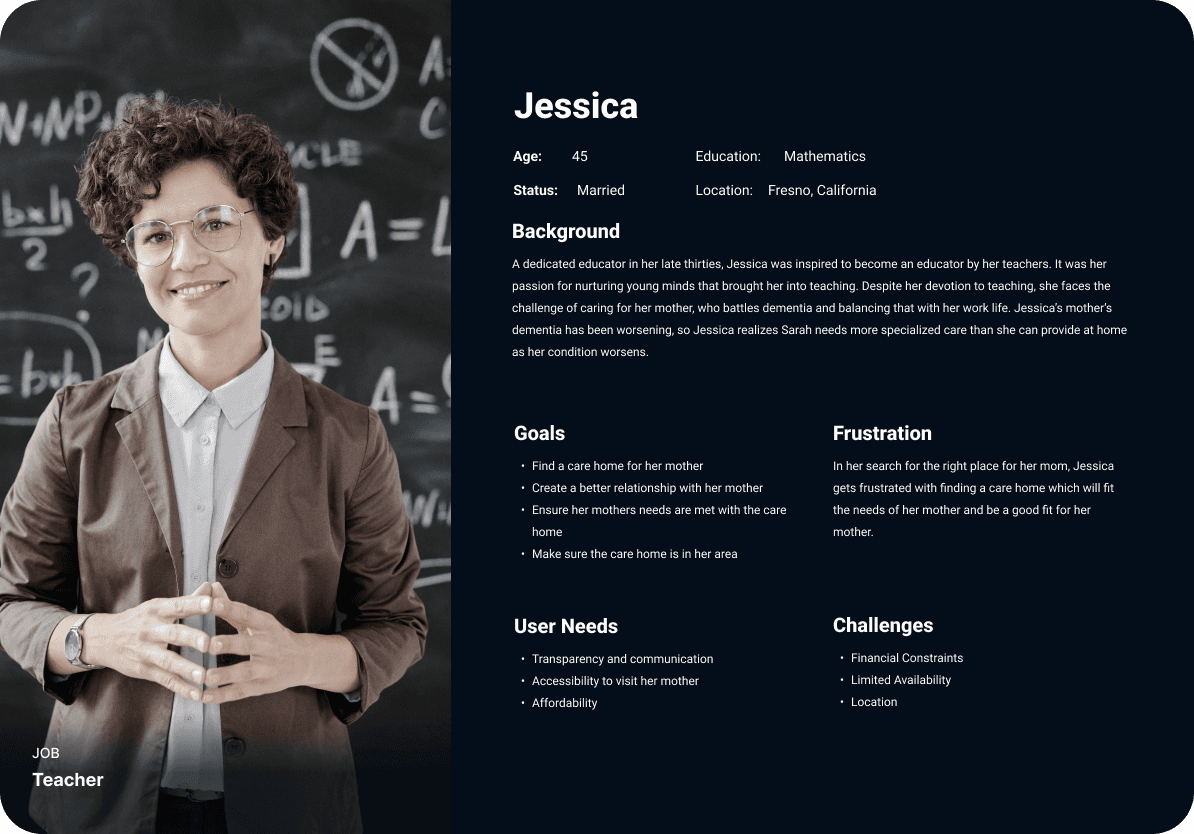

Jessica is having difficulty balancing work and giving care to her mother with dementia. She has realized that her mother needs specialized care for her condition.
Jessica is having difficulty balancing work and giving care to her mother with dementia. She has realized that her mother needs specialized care for her condition.
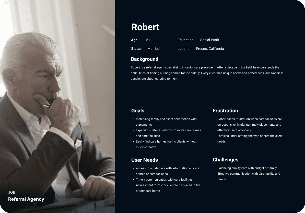
Robert is a care social worker who is passionate about finding the right homes for his clients. He understands that every client has unique needs and preferences.
Robert is a care social worker who is passionate about finding the right homes for his clients. He understands that every client has unique needs and preferences.

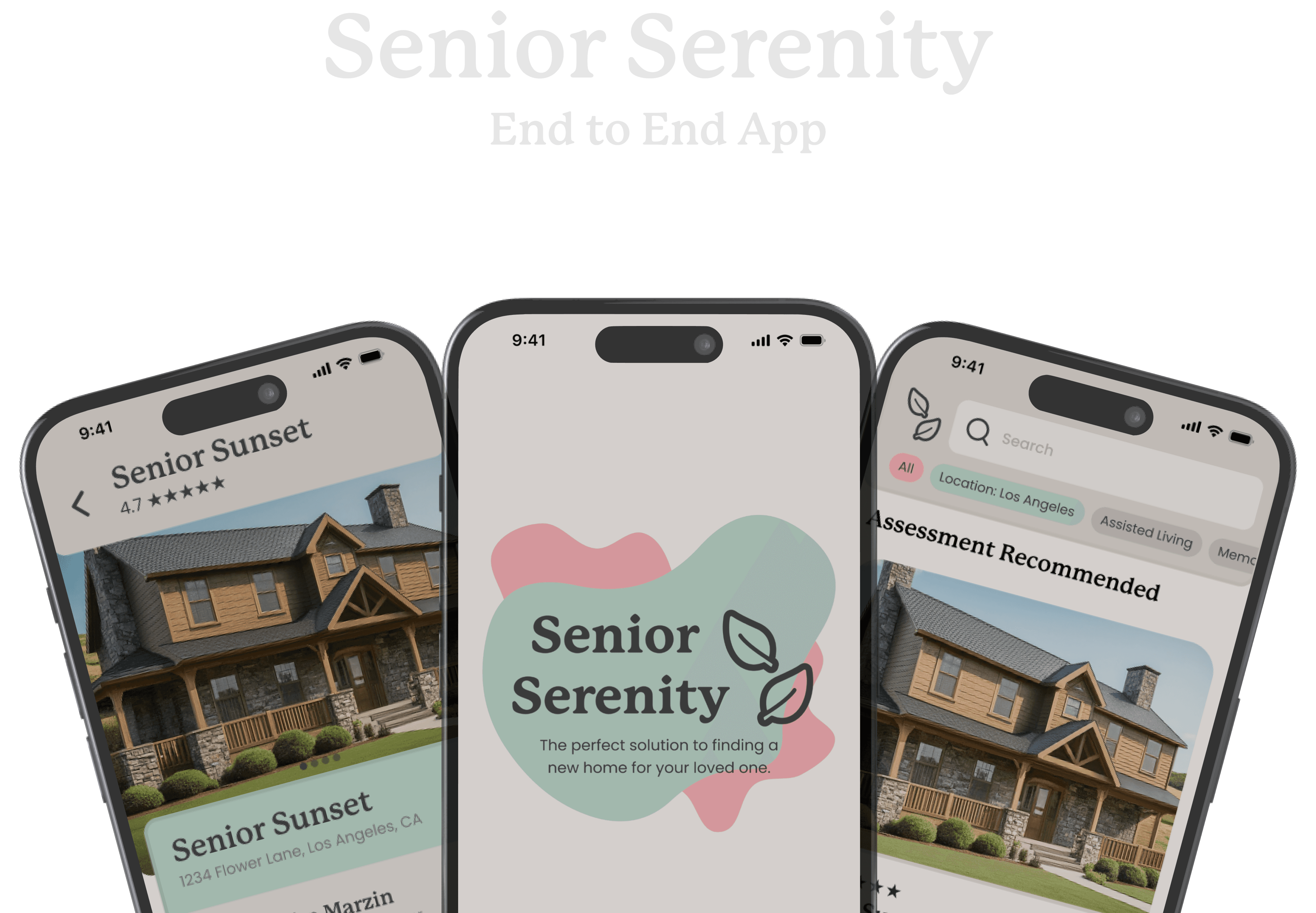
Introducing, Senior Serenity.
Introducing, Senior Serenity.
I wanted Senior Serenity to be easy to use, but even before using the service, I wanted the user to feel welcome and trust the application to give care homes they would potentially have their client or family member be residing in.
I wanted Senior Serenity to be easy to use, but even before using the service, I wanted the user to feel welcome and trust the application to give care homes they would potentially have their client or family member be residing in.
Color Palette
The color green can invoke feelings of
balance, serenity and joy.
The color green can invoke feelings of balance, serenity and joy.

"sea green"
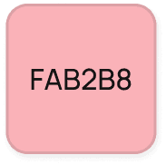
"cotton candy"
The color pink can invoke feelings of
peace, calm, and hopefulness.
The color pink can invoke feelings of peace, calm, and hopefulness.
I need a darker color for the text and
I decided to use a lighter shade of
black for it to be easier on the eyes.
I need a darker color for the text and I decided to use a lighter shade of black for it to be easier on the eyes.

"slate"
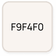
"off-white"
A pure color white can be a bit harsh,
so I chose to add a hint of orange.
A pure color white can be a bit harsh, so I chose to add a hint of orange.
Font
P22 Mackinac Pro
P22 Mackinac Pro
P22 Mackinac Pro
Poppins
Poppins
Poppins
Icons

Logo

leaves = calmness + dependability
leaves = calmness + dependability
warm, friendly font
During the creation of the logo, I wanted the main font to be included with something that symbolizes peace, thus the leaves.
During the creation of the logo, I wanted the main font to be included with something that symbolizes peace, thus the leaves.
Components


Mid-Fidelity Wireframe
Mid-Fidelity Wireframe
While creating the mid-fidelity wireframes, I was looking at applications I could take inspiration from and the one application that has a similar service is AirBNB. I conducted a usability test for my mid-fidelity wireframes. I had the users complete 4 tasks:
Create an account and complete assessment of a potential 67 year old dementia resident.
Send a message to the care home and ask for availability for a tour.
Schedule a tour with the care home.
Edit the assessment of potential 67 year old dementia resident.
The testing had 5 participants with ages ranging from 22-51. All participants completed each task at a good amount of time, but I still had received some feedback. I choose what feedback what would be my priority for when I create my high-fidelity wireframes:
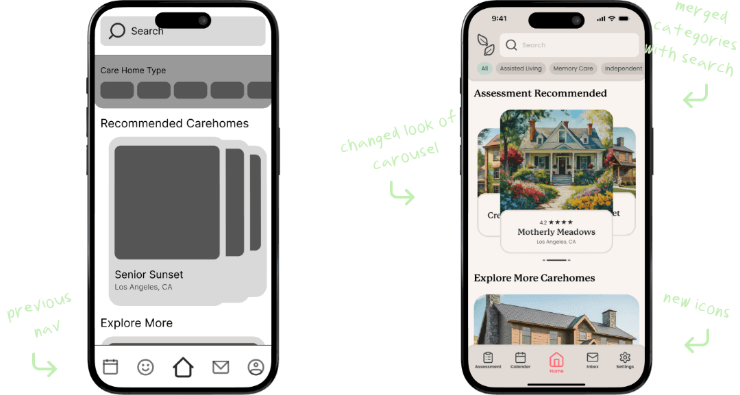
Change icons to something that would better suit each page
Change icons to something that would better suit each page
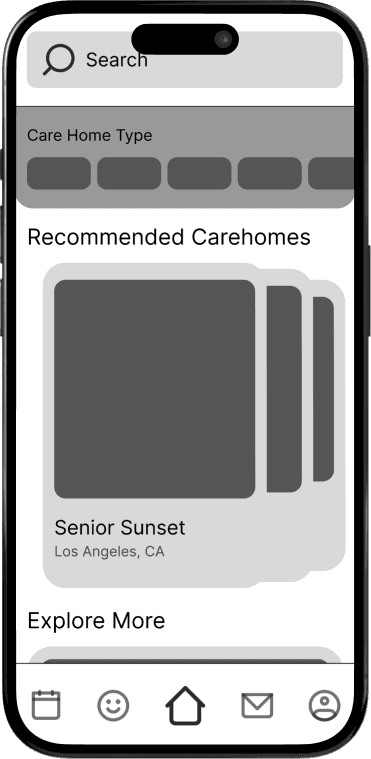
previous nav
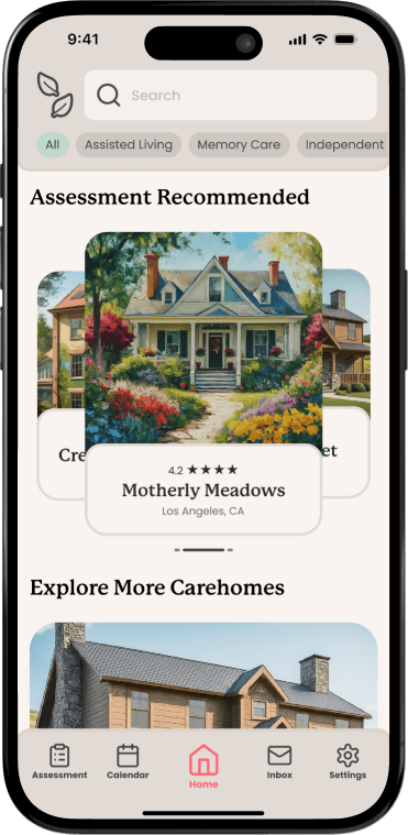
new icons
changed look of carousel
merged categories with search
previous nav


new icons
changed look of carousel
merged categories with search

previous nav


new icons
changed look of carousel
merged categories with search
I decided to merge the categories with the search bar for a cleaner look. Changed the look of the carousel so the user can swipe left or right. As for the icons, I changed almost all icons to to better fit the page it leads to and added text for clarity.
I decided to merge the categories with the search bar for a cleaner look. Changed the look of the carousel so the user can swipe left or right. As for the icons, I changed almost all icons to to better fit the page it leads to and added text for clarity.
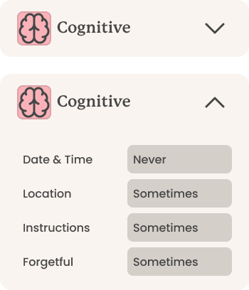
Modify assessments page
Modify assessments page
boxes to drop downs


boxes to drop downs


boxes to drop downs
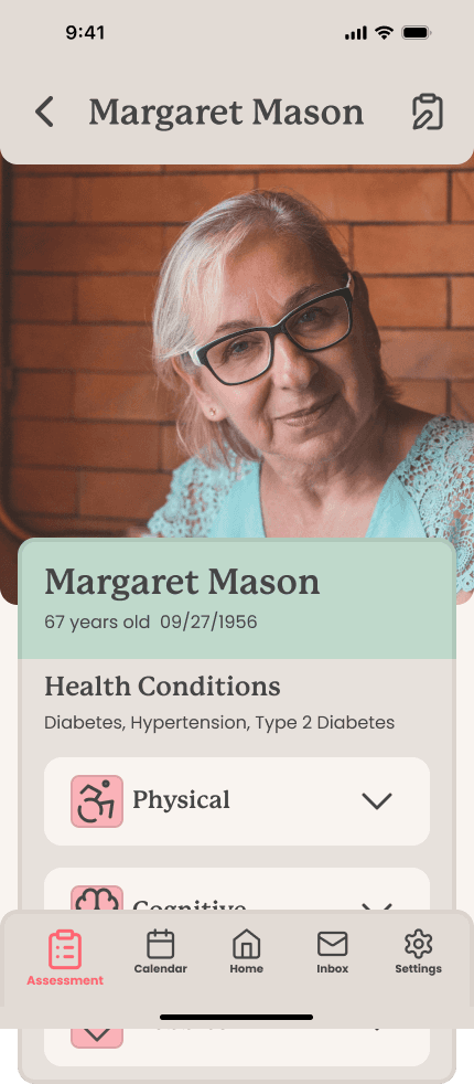
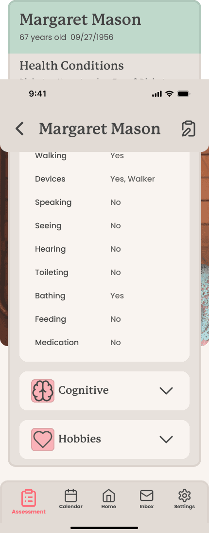
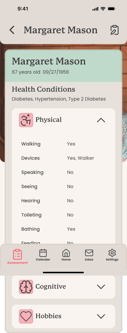
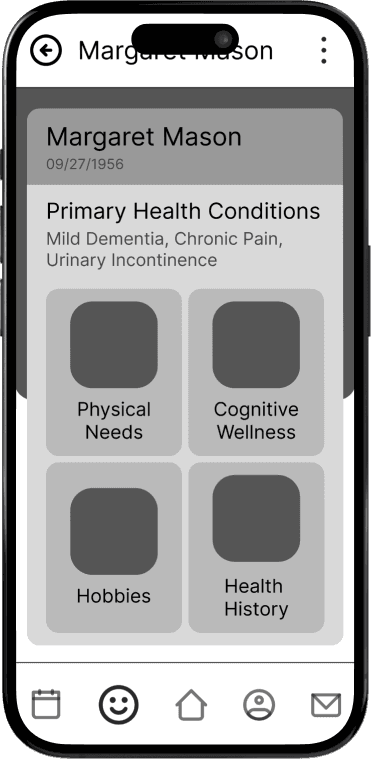
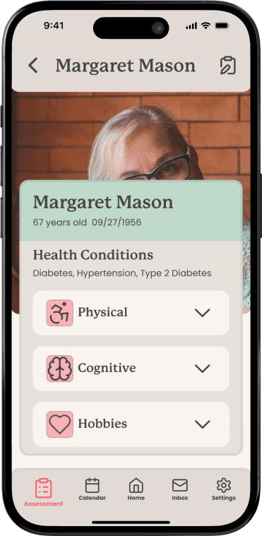
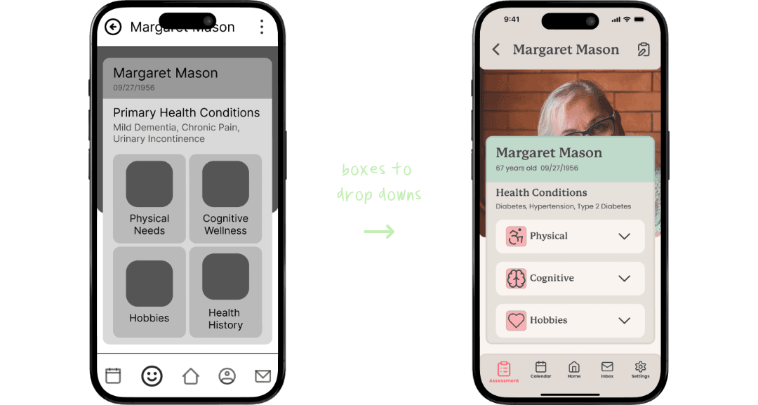
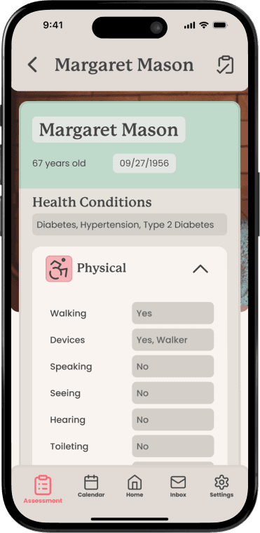
Redesigned the assessments tab so that each tab will be a drop down instead of going to a different page. Change the menu icon into an edit icon.
Redesigned the assessments tab so that each tab will be a drop down instead of going to a different page. Change the menu icon into an edit icon.
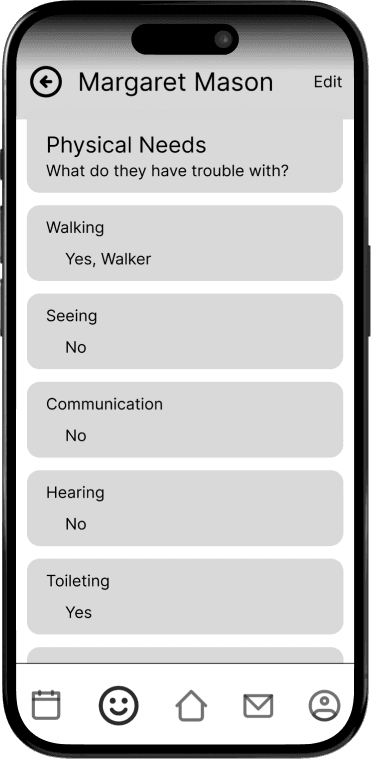
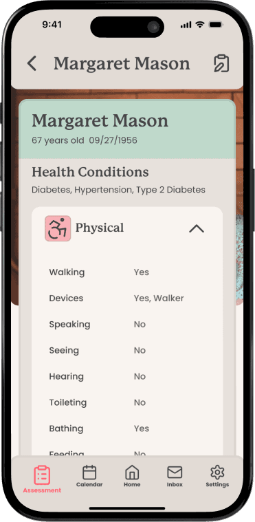
can see all assessments on same page
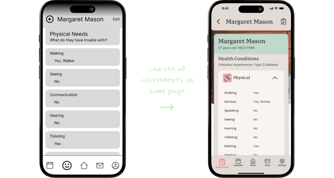


can see all assessments on same page


can see all assessments on same page
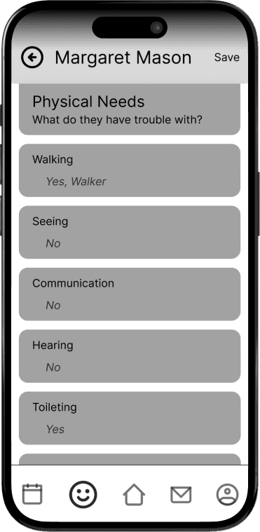
can be edited on same page
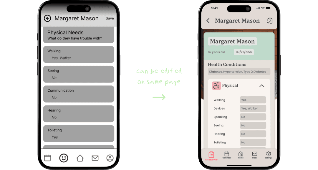


can be edited on same page


can be edited on same page
Previously, tapping on of the categories in the assessments tab would lead into a new page, but in the hi-fidelity, I change the the design entirely so that the assessment could be seen and edited in the same page
Previously, tapping on of the categories in the assessments tab would lead into a new page, but in the hi-fidelity, I change the the design entirely so that the assessment could be seen and edited in the same page
Clarification of whether or not the tour is requested or booked.
Clarification of whether or not the tour is requested or booked.
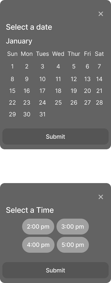
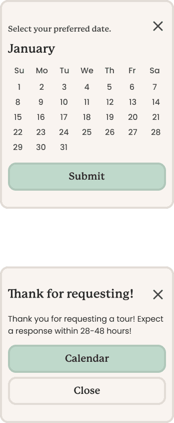
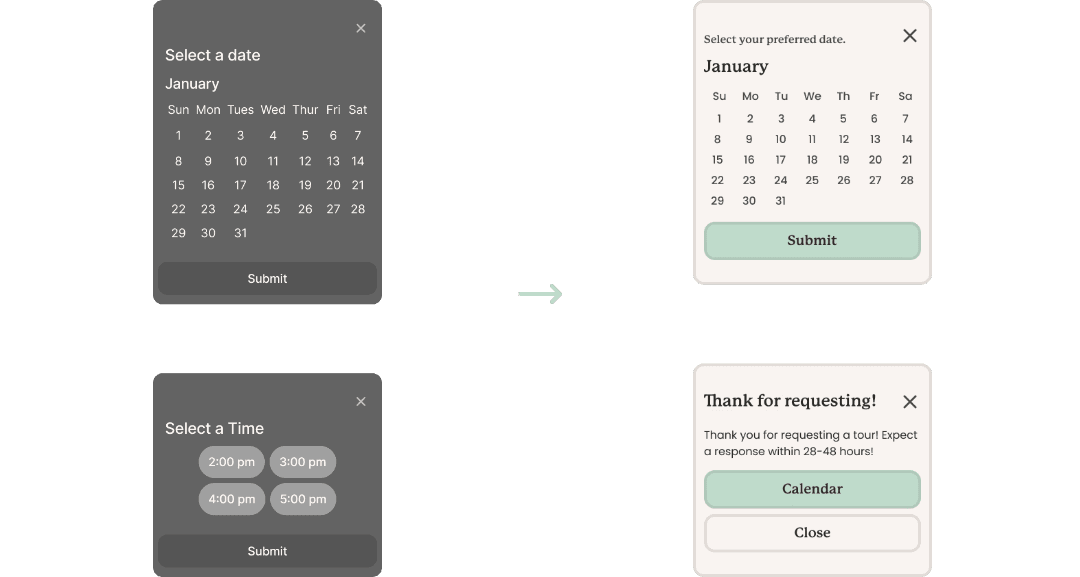


When scheduling for a tour, the user were confused as to if the tours were requested or booked. So, I decided that it would be more clear if the user were to just schedule a date and wait for a response from the care home.
When scheduling for a tour, the user were confused as to if the tours were requested or booked. So, I decided that it would be more clear if the user were to just schedule a date and wait for a response from the care home.
Hi-Fidelity Usability Test
Hi-Fidelity Usability Test
After creating the first hi-fidelity mockup, I once again conducted usability tests. The tasks I had these participants do were similar to the tasks I had my mid-fidelity participants do. During these tests, I had created a scenario for each of the task and I had my participant be an adult child who was looking to place their mother with dementia in a care home.
I had 5 participants with ages ranging from 23 to 51. All tasks were completed with minimal feedback. Creating the final mock-up I had less changes compared to the mid-fidelity to hi-fidelity. Here is some of the feedback given:
After creating the first hi-fidelity mockup, I once again conducted usability tests. The tasks I had these participants do were similar to the tasks I had my mid-fidelity participants do. During these tests, I had created a scenario for each of the task and I had my participant be an adult child who was looking to place their mother with dementia in a care home.
Scenario:
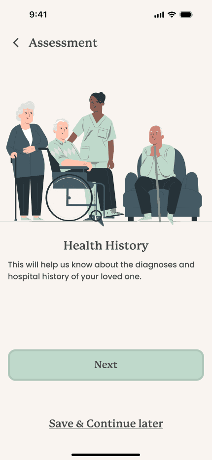
Your name is Melissa Mason and you are looking for a care home for your 67 year old mother with dementia. Your mother has been using a walker for a couple years now and is often confused. Although being confused, she can feed herself and use the toilet on her own, but needs some assistance bathing. She also needs assistance in taking her medication for hypertension and her Type 2 Diabetes Mellitus. Whenever she has free time, she enjoys to read while sitting in the patio.
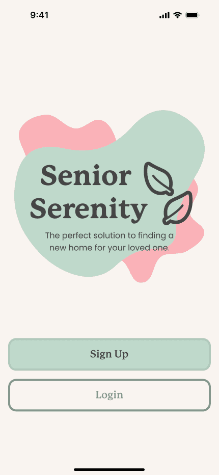
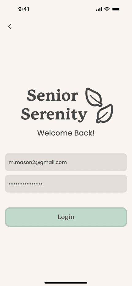
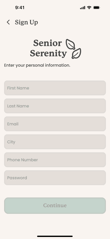
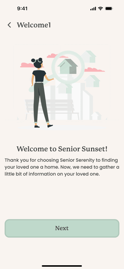
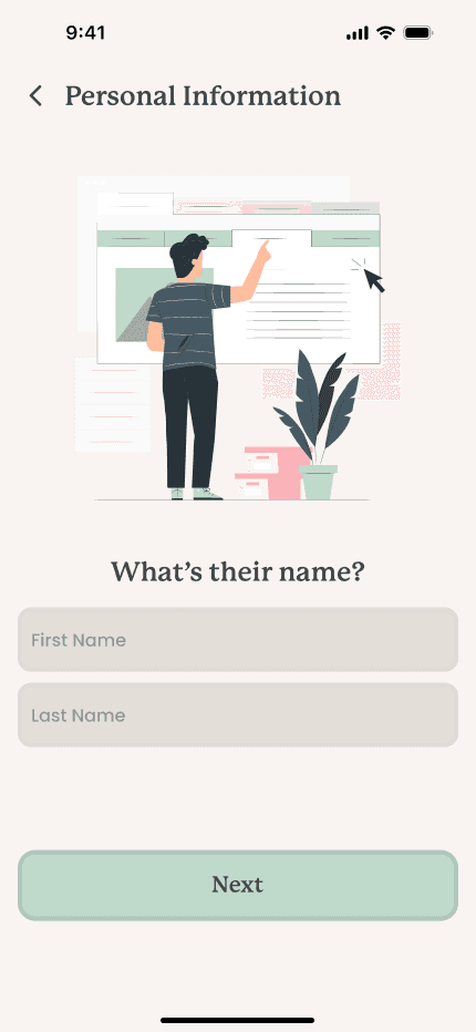
You are browsing through applications in the AppStore and download an application called Senior Serenity. You download the application and when you first open it up, it greets with with the welcome screen. You want to use the application, so you want to create an account.
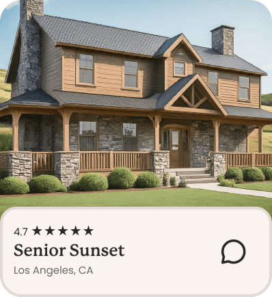
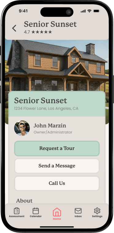
After creating your account and finishing the assessment, you start scrolling through recommended care homes. You are interested in the care home named Senior Sunset. You tap on the care home, and start looking through it's pictures and decide you want to request a tour.
You scheduled your tour and start scrolling on Senior Sunsets details page. After reading it's content, you decide you want to message the care home.
After sending your message, you remembered your mother having difficulty reading some road signs while driving her to her doctors appointment. You want to edit the assessment.
I had 5 participants with ages ranging from 23 to 51. All tasks were completed with minimal feedback. Creating the final mock-up I had less changes compared to the mid-fidelity to hi-fidelity. Here is some of the feedback given:
Elimination of Whitespace
Elimination of Whitespace
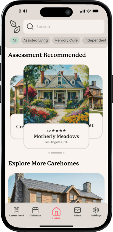
previously, a carousel
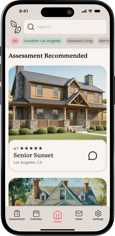
Changed to cards
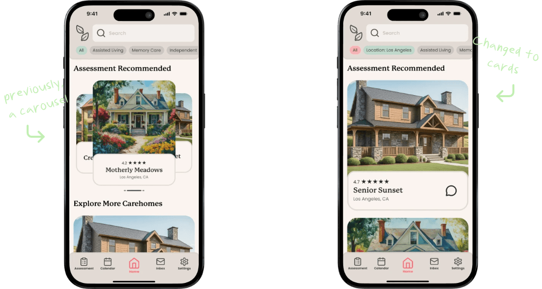

previously, a carousel

Changed to cards


previously, a carousel

Changed to cards
I thought the carousel was a nice touch, but it left a lot of whitespace which made it look odd. I was advised by my mentor to find a way to eliminate the whitespace, so I decided to ditch the carousel idea all together and have the recommended care homes be in cards. This way each of the care homes recommended have their own space to shine, and users are more used to scrolling through content on their phones.
I thought the carousel was a nice touch, but it left a lot of whitespace which made it look odd. I was advised by my mentor to find a way to eliminate the whitespace, so I decided to ditch the carousel idea all together and have the recommended care homes be in cards. This way each of the care homes recommended have their own space to shine, and users are more used to scrolling through content on their phones.
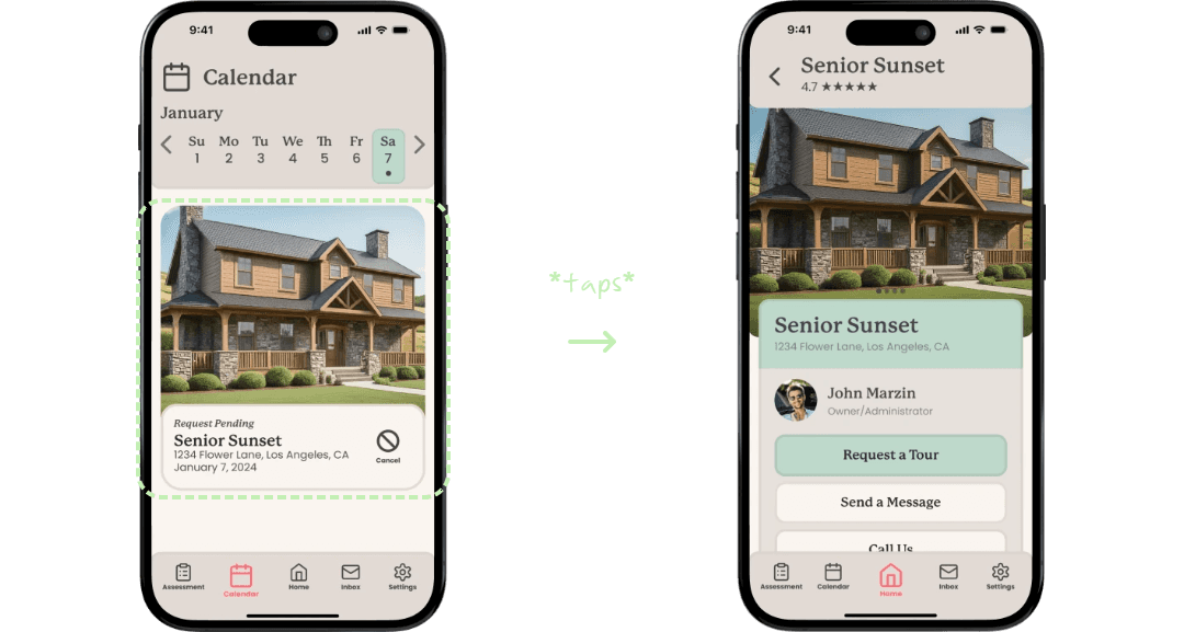
Requested tour card functions
Requested tour card functions
*taps*


*taps*


*taps*
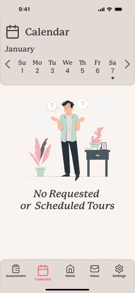
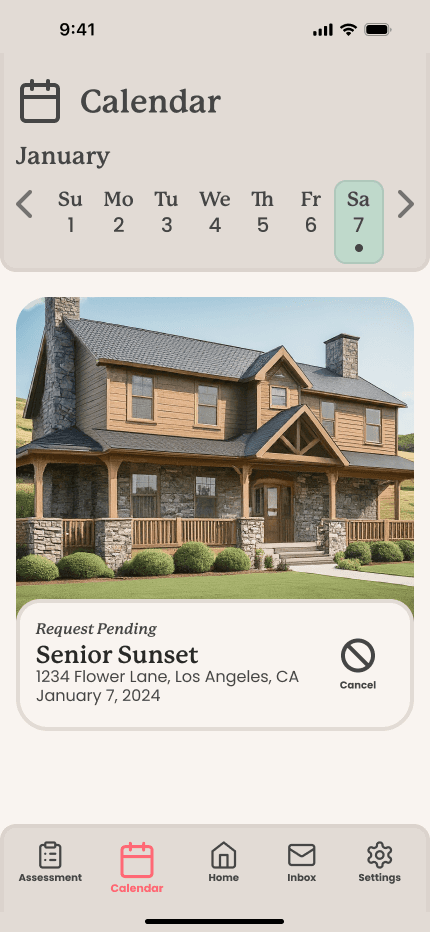
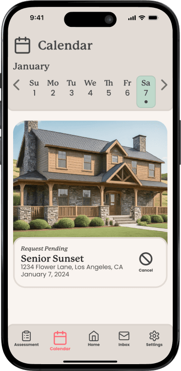
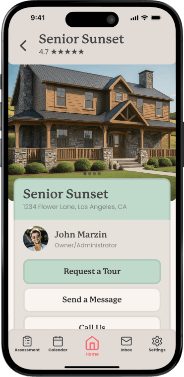
The participants of the tests were expecting to be able to "do something" with the card in the calendar besides just being able to cancel. Two participants suggested that tapping on the card should be able to route them back to the care home details page.
The participants of the tests were expecting to be able to "do something" with the card in the calendar besides just being able to cancel. Two participants suggested that tapping on the card should be able to route them back to the care home details page.
Different ways to contact care home
Different ways to contact care home
added an option to call
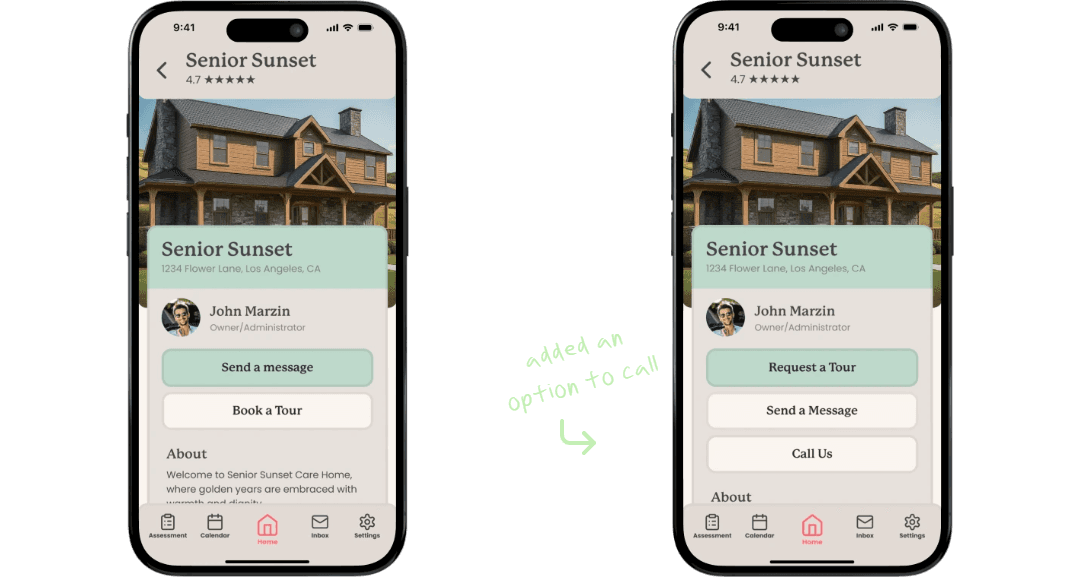


added an option to call


added an option to call
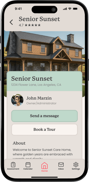
Participants of usability test were asking for a way to call the care home if ever they did not want to wait for an answer through messages.
Participants of usability test were asking for a way to call the care home if ever they did not want to wait for an answer through messages.
Option to message after requesting a tour.
Option to message after requesting a tour.
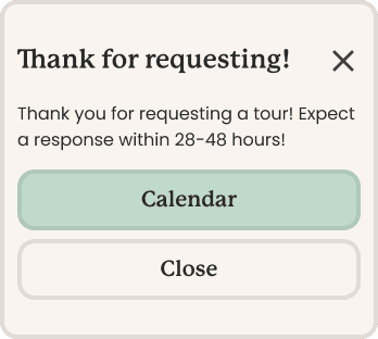
added option to send a message
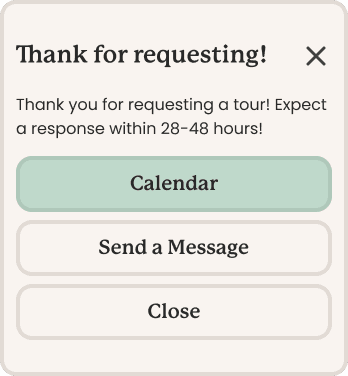
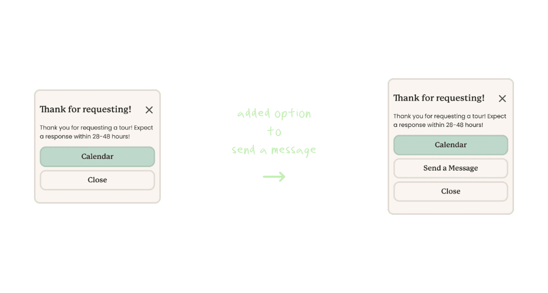

added option to send a message


added option to send a message

Participants of the usability test suggested adding a easier way to send a message to the care home after requesting for a tour.
Participants of the usability test suggested adding a easier way to send a message to the care home after requesting for a tour.
Missing feature
Missing feature

added plus icon
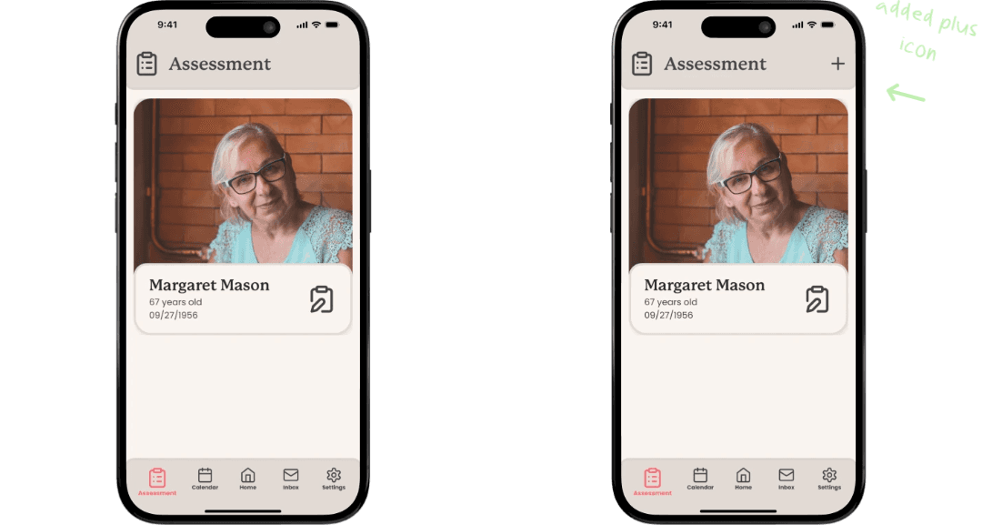


added plus icon


added plus icon
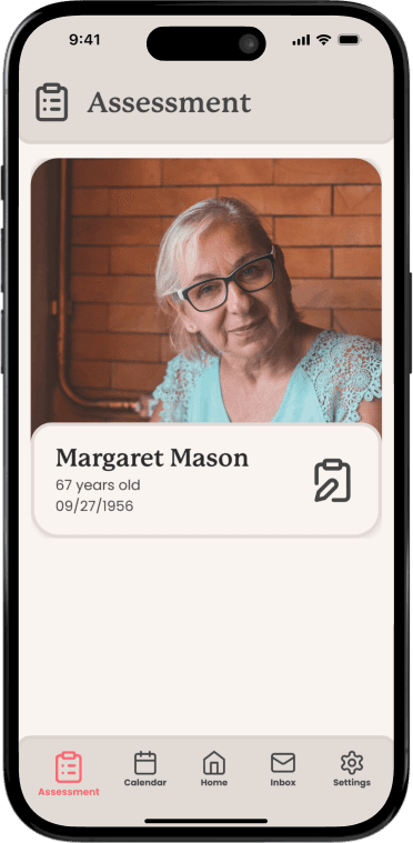
A user mentioned there was no way to add another assessment after the onboarding, so I added a "+" icon to indicate being able to add another assessment.
A user mentioned there was no way to add another assessment after the onboarding, so I added a "+" icon to indicate being able to add another assessment.
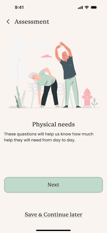
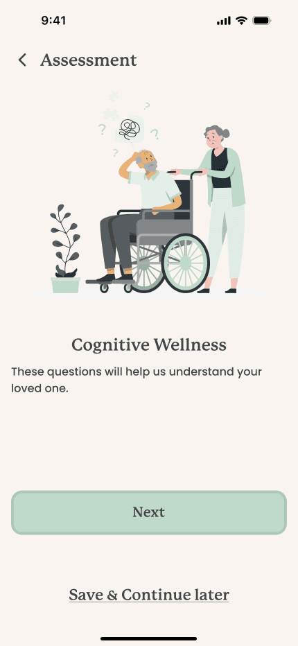
A look through all the screens of the final mock-up.
A look through all the screens of the final mock-up.
Users enjoyed the ability to be able to quickly browse, contact, and request tours efficiently within Senior Serenity. I was concerned that the onboarding assessment would be too long, but when asked the users said the length was fine and they liked having the option to skip, and continue at a later date. All users completed each task, with minimal feedback.
Users enjoyed the ability to be able to quickly browse, contact, and request tours efficiently within Senior Serenity. I was concerned that the onboarding assessment would be too long, but when asked the users said the length was fine and they liked having the option to skip, and continue at a later date. All users completed each task, with minimal feedback.
Final Thoughts
Final Thoughts
I initially had this idea a couple years back when I was first was deciding whether I wanted to change my career or not. I still remember the day vaguely. We had just finished a weekend long music festival. It was hot, we were all tired, but we needed something to eat and the idea of changing my career was always in the back of my mind. I had brought up the idea briefly, and my friends had supported me from the start. This was the first time I spoke the idea, and not just think it.
During the testing of Senior Serenity, I had a death of a family friend and that really took a turn for me. My motivation to create this application was very high in the beginning, but after her death it was starting to get difficult to move on with what I wanted for my career. What if I'm just wasting my time? Maybe I should just stick to being an administrator at a care home? Stay with the family business. It's easier isn't it? After some time of thinking, I decide that life was too short to not care about what I wanted to do for the rest of my life. I didn't want to stick to a job that didn't bring me any joy.
Besides learning a life lesson, Senior Serenity also helped me become a better UX and UI Designer. During UX design, I enjoyed creating a scenario for the usability testing so the participant can become more emersed in the testing. During the UI design, I created animations so that the application can come to life.
Creating Senior Serenity was many things for me. It helped me realize that life is too short to not try and be complacent. Senior Serenity was an idea that came to life for me. The prototype for this application is one that I am very proud of, and I hope you enjoy it.
